Eleven interior design websites that show the work beautifully and make enquiring easy, with what each one does well.
Say who they work for, what and where
Tell the story behind each project
Make booking a consultation easy
Show proof: press, awards and testimonials
Structure services and FAQs for search
Load fast and work on every device
The round-up
Studios that show their work at its best and make enquiring easy. Screenshots were taken when each site was reviewed for this round-up. Designs change, so visit each site for its latest version.
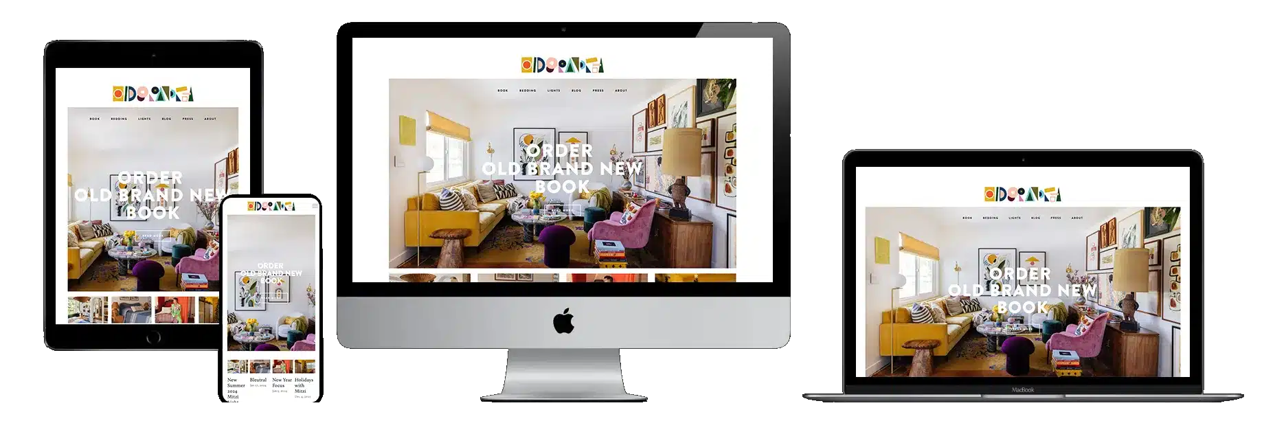
A bold brand blending vintage and contemporary style, and a website that commits to it fully, with personal stories and inspiration throughout the blog.
A distinct brand personality
Content and a shop as extra ways in
A deep blog archive
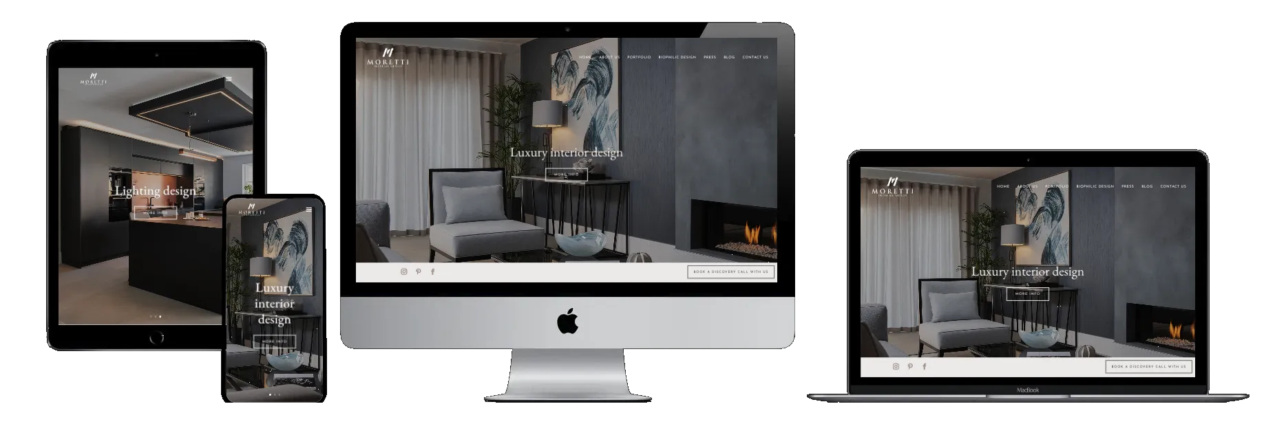
Answers the questions clients have before they enquire: what the studio does, how the process works and what happens next.
Clear sustainability positioning
Services that are easy to understand
An interactive walkthrough of the process
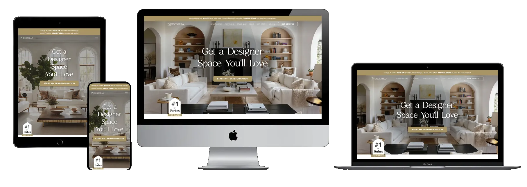
Built like a product rather than a brochure: the style quiz turns browsing into a first step and gathers useful detail before the first conversation.
An interactive design quiz
Calls to action that don't feel pushy
Reviews where decisions are made
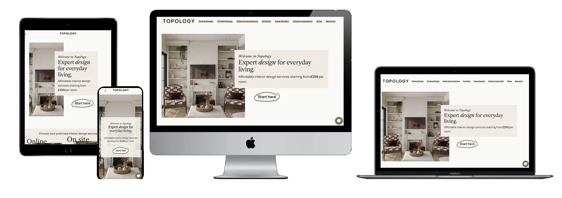
A welcoming tone and a useful blog make the studio feel approachable, with the next step always close at hand.
Warm, personal branding
Genuinely useful blog content
Consultation calls to action throughout
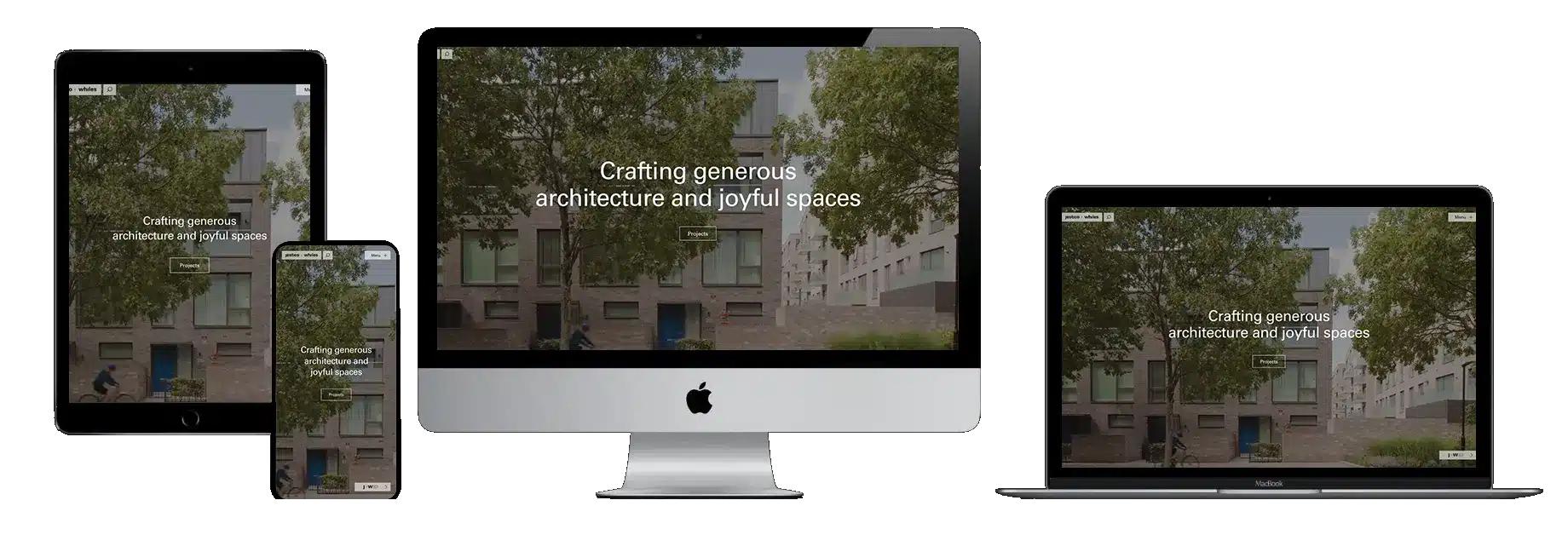
Strong photography, generous spacing and restraint let the work speak for itself.
One visual identity across architecture and interiors
Full-width project imagery
A modernist, uncluttered layout
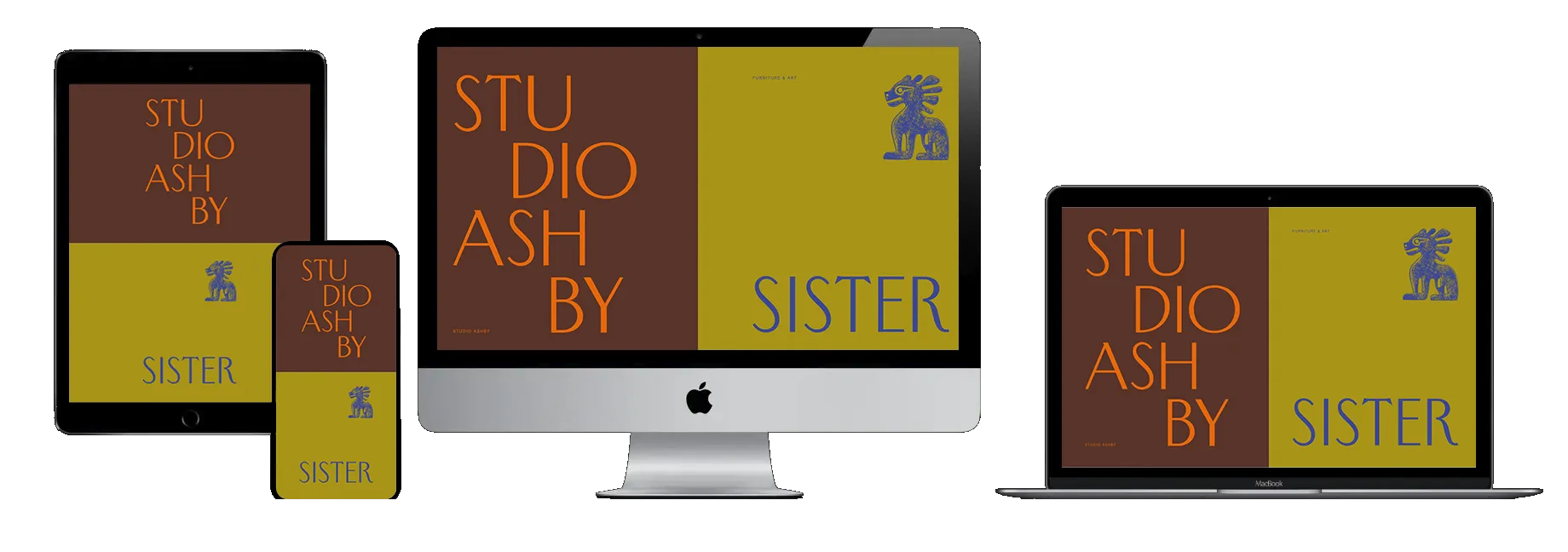
Quiet confidence: elegant type, curated imagery and invitations to get in touch that appear when the visitor is ready.
Luxury positioning without being loud
A portfolio that flows
Calls to action that match the brand's tone
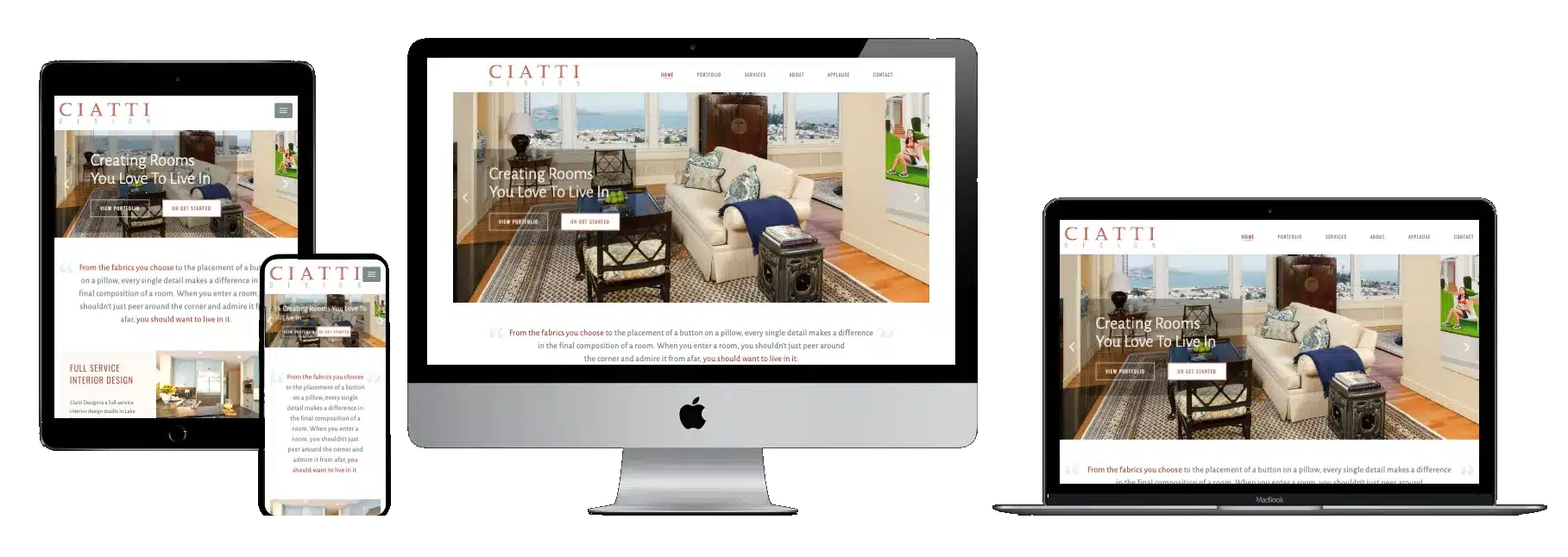
Premium in feel but clear in structure, so visitors and search engines both understand what the studio offers.
A luxury-first design language
Clearly defined services
Content structured for search
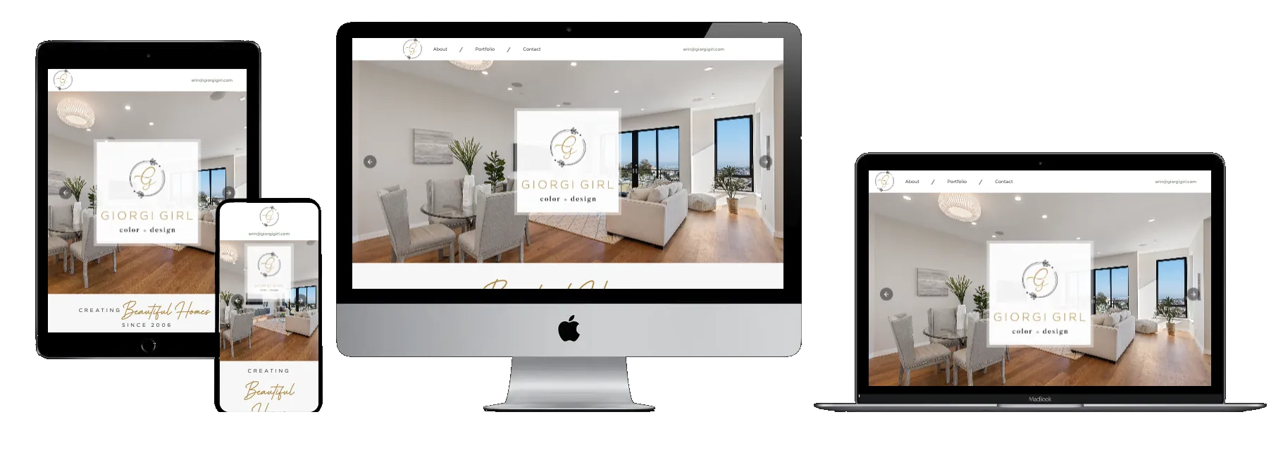
Tone is the lever here: the site feels current, social and easy to relate to.
A modern lifestyle aesthetic
Social feeds that keep it current
Conversational copy
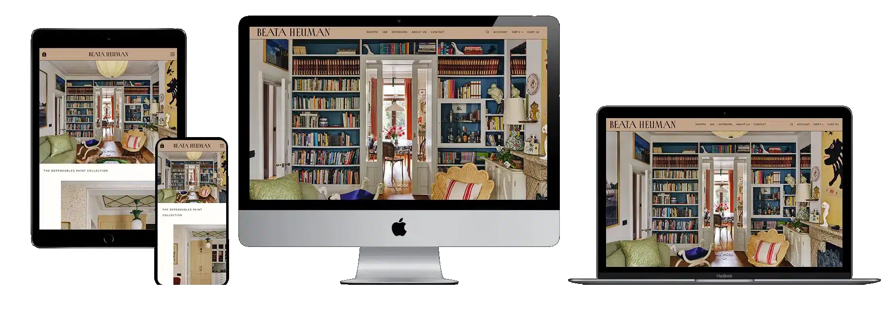
Unconventional but still intuitive, with each project presented as a story rather than a gallery.
A memorable, distinctive brand world
A journal that tells project stories
An integrated shop
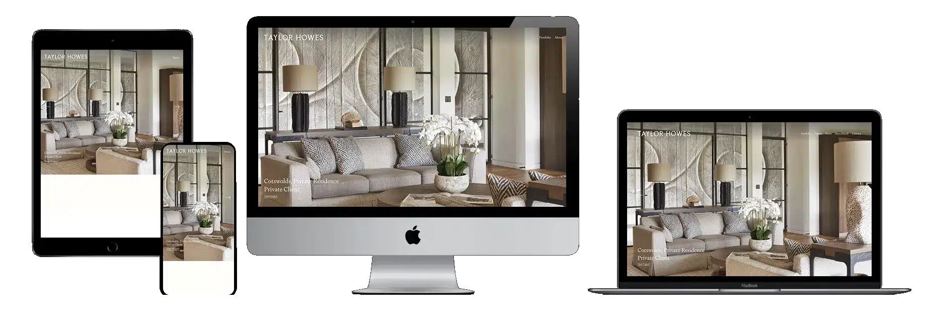
Polished and assured, with press and awards placed where visitors are weighing up a high-value project.
Editorial, magazine-style presentation
Full-screen portfolio imagery
Press and awards as proof

Clare Norrish Interior Design ↗
A site we redesigned and rebuilt in Elementor. Calm layouts give the work space, and the structure leads visitors from projects to the studio's full-service offer.
Refined, minimal design
A clear full-service structure
Portfolio filtering by project
Key takeaways
Whatever your style, the strongest studio websites get these right.
High-quality imagery, with the brief, the constraints and the transformation alongside.
Clear navigation, clear services and enquiry routes that feel effortless.
Testimonials, press and awards placed where they reduce the risk of enquiring.
Restraint for luxury clients; warmth and personality for lifestyle audiences.
Service pages, FAQs, consistent headings and fast pages.
Your studio next
Book a free 30-minute call about your studio's website and how it could show your work at its best.
