Eleven café and coffee shop websites with real personality, from menus and ordering to photography and storytelling, and what each one does well.
Two of them are sites we designed and built ourselves, Little Bagel Co. and ODD Shop in Bristol, and they're labelled so you can spot them.
Menus, ordering, bookings and social feeds, built on WordPress and Elementor.
Quick answer: In our view, the best café websites make the everyday things easy. Customers should be able to find your menu, opening hours, location and a way to order in a tap or two on their phone. Once that's in place, photography, illustration and tone of voice give the site its personality. The eleven sites below get both right.
The round-up
Designs change, so visit each site for its latest version.
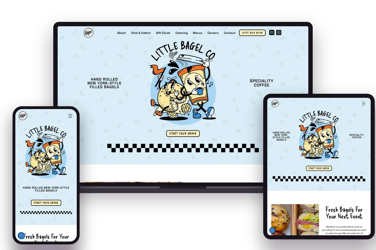
Bold colour and illustrated bagel characters give Little Bagel Co. plenty of personality, but the practical links do the heavy lifting. Menus, Click & Collect, Catering and Gift Cards all sit in the main navigation, with Uber Eats and the phone number in the header. Further down, the homepage covers catering for events, and the footer lists opening hours for every day of the week.
Ordering options visible from every page
Opening hours for every day in the footer
An Instagram feed that keeps the homepage current
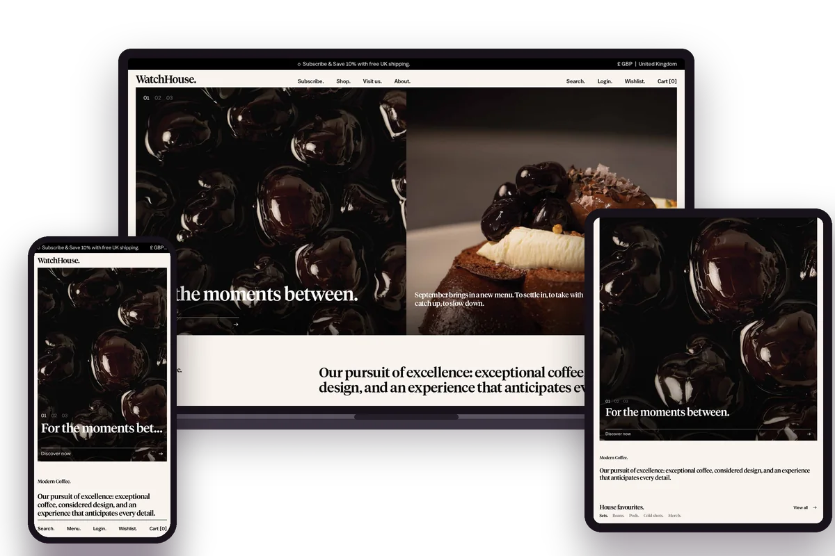
WatchHouse pairs a clean, premium look with branding that stays consistent on every page, down to the full stop after each heading. The navigation is the standout. Its Visit us menu names every café, split into Brunch Houses and Espresso Houses, alongside the menu, loyalty app and private hire. A separate shop menu handles beans, pods, equipment and subscriptions without crowding the café side.
A Visit us menu that names each location, split into Brunch Houses and Espresso Houses
Menu, loyalty app and private hire grouped with the locations
A subscription and shop that sit comfortably alongside the cafés
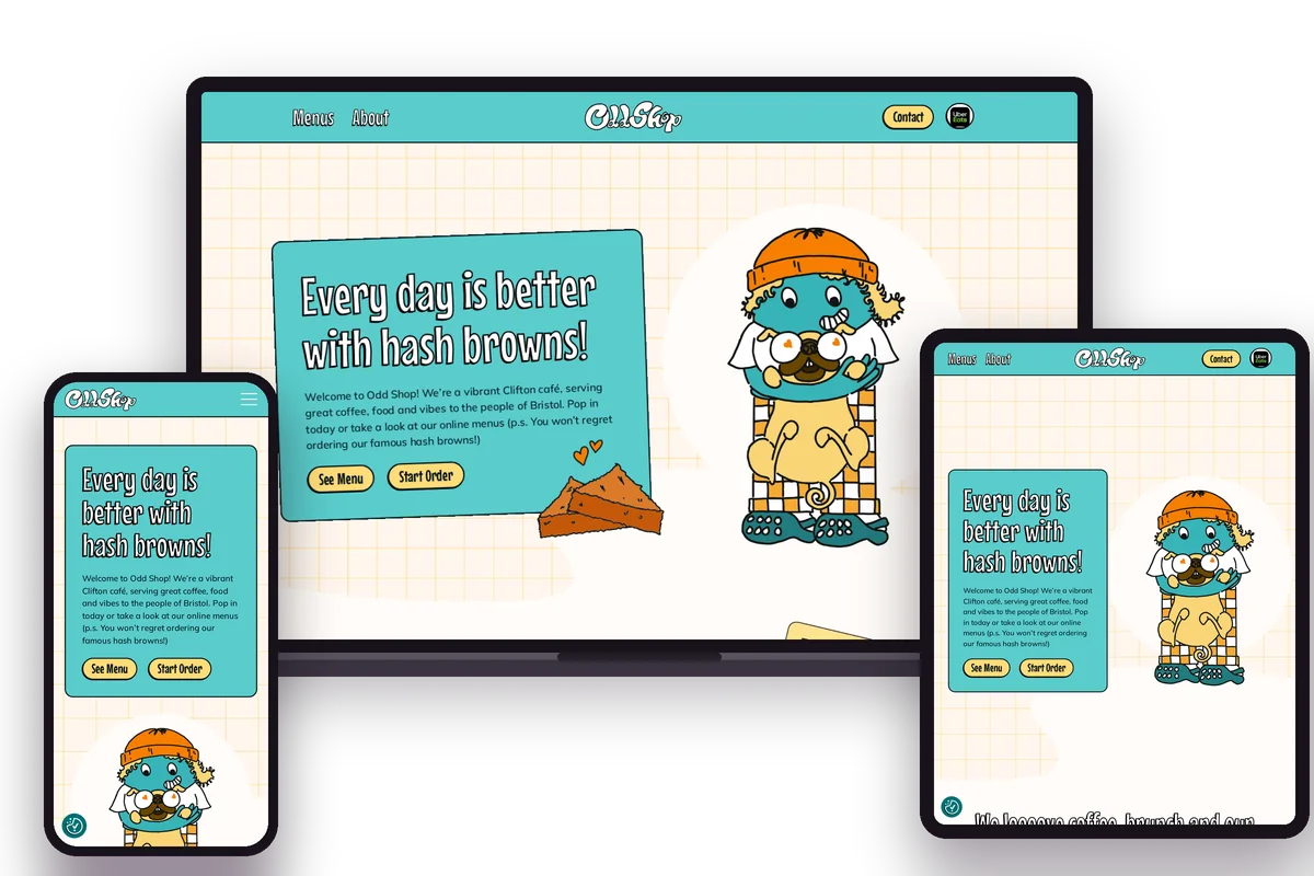
Playful illustration, mascots and confident colour make the site feel like the Clifton café itself. Behind the bold look, it's simple: three menu items and a homepage that leads with See Menu and Start Order. Google reviews from real customers, an Instagram feed and a dog-friendly welcome do the selling further down, and opening hours sit in the footer of every page.
Ordering one tap from the homepage
Google reviews from real customers on the homepage
Opening hours and a dog-friendly welcome in the footer
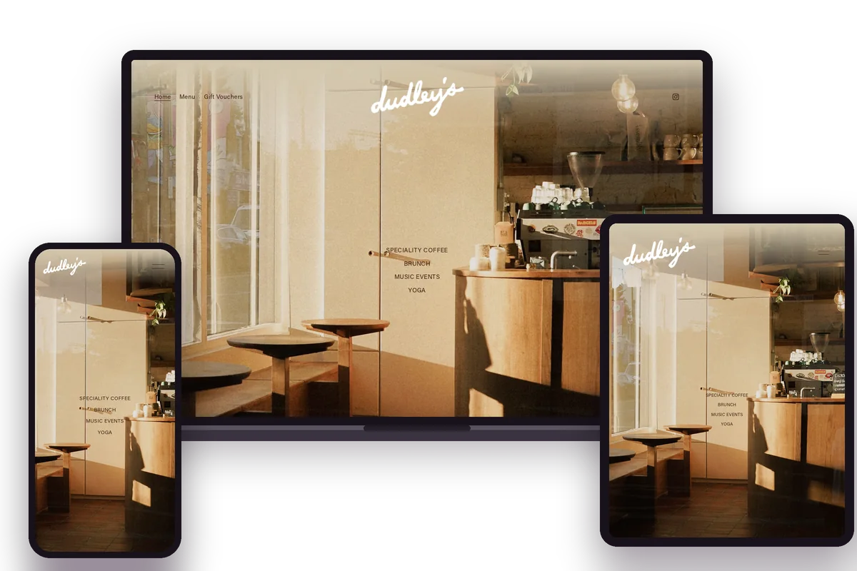
A neighbourhood café in Walthamstow, Dudley's keeps its website to the essentials. The navigation has just three items: Home, Menu and Gift Vouchers. Opening hours for each day, the address and an email address sit in the footer, and an Instagram feed fills the homepage with the food and the café itself. It shows how little a small café actually needs.
Opening hours for every day in the footer
A prominent Instagram feed
Only the essentials in the navigation
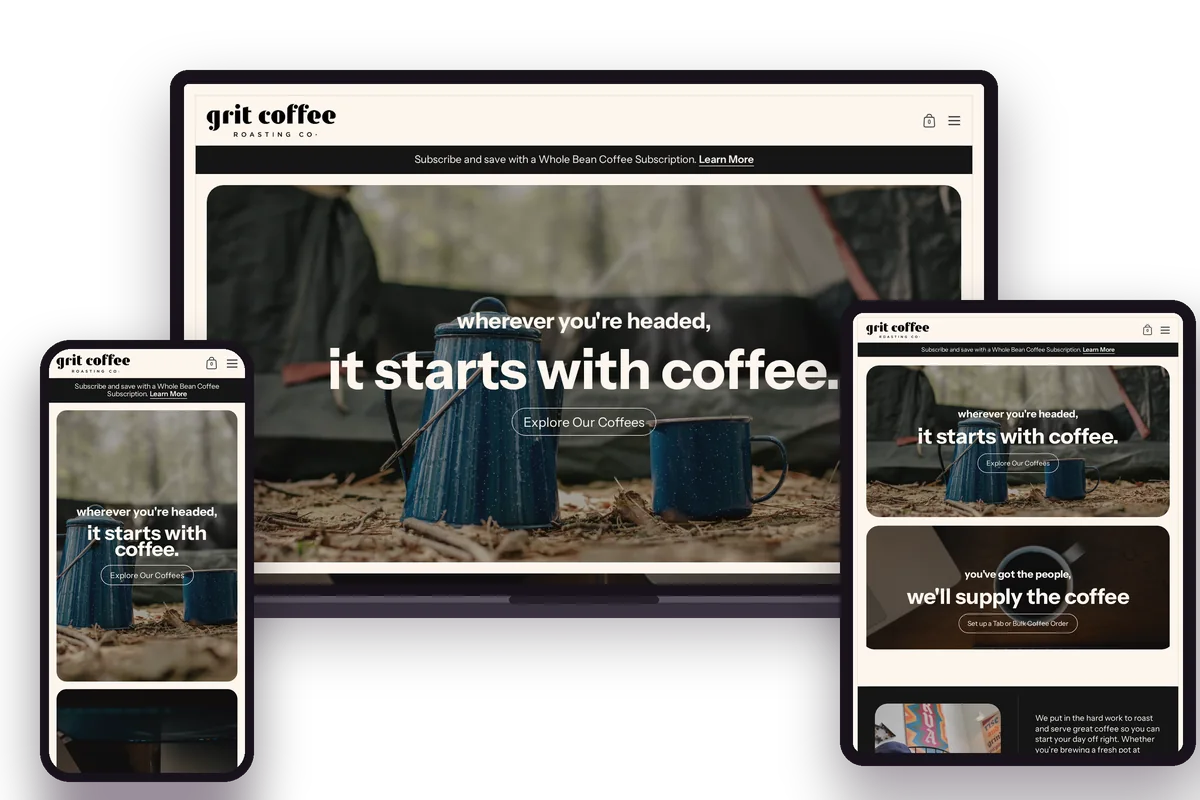
Grit Coffee does two jobs well: running a group of cafés in Virginia and selling coffee to people who'll never visit. The navigation keeps them apart, with a Shop menu for whole bean coffee, care packages, gear and subscriptions, and quick routes to Locations, Tabs & Catering and Order Online for Pickup. High-quality photography and short, punchy copy keep it feeling like a café brand.
Storytelling about origins and values
Clean, readable typography
Subscriptions and gift sets in the shop
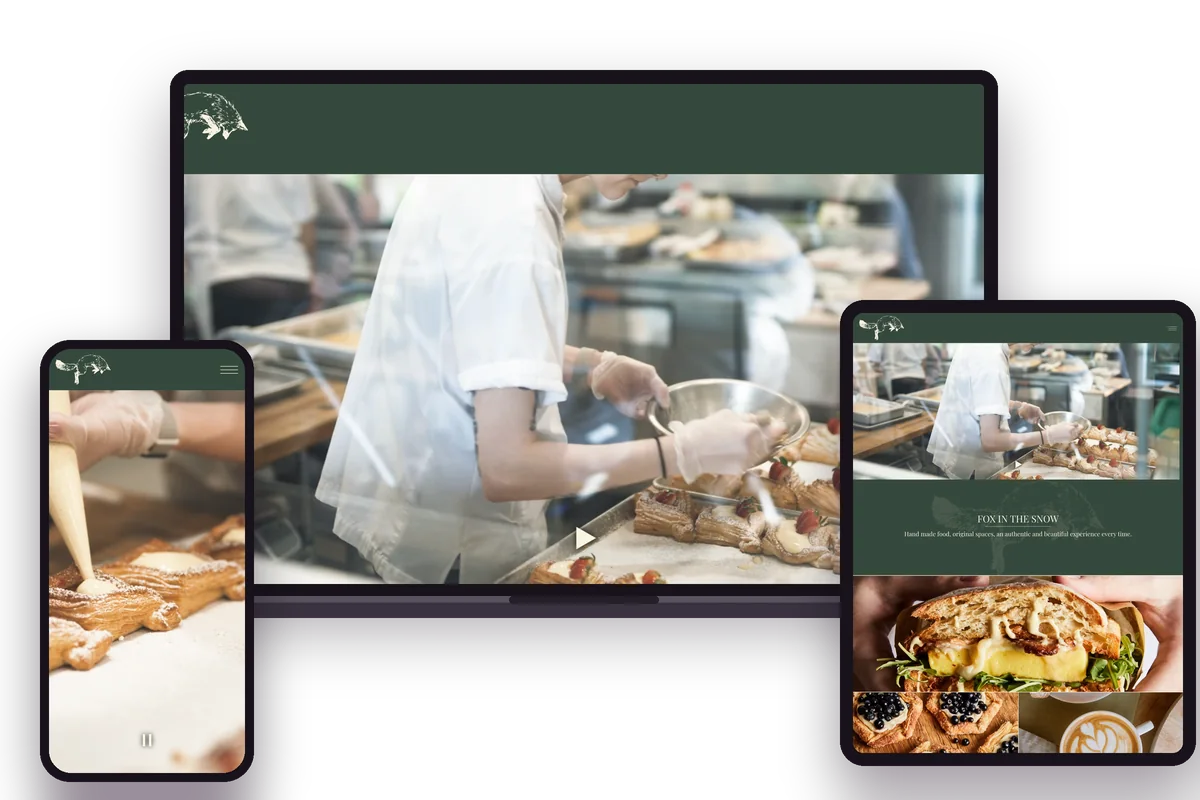
Fox in the Snow calls itself a modern bakery and coffee shop, and the site lets photography of the food and the spaces do the talking. The navigation is short but practical: Menu, Locations, Gift Cards, and separate options for in-store and delivery catering. The homepage lists all seven Ohio locations, so finding the nearest one takes seconds rather than a trip through a store finder.
Food photography that sells the visit
An About page that tells the story
Minimal navigation
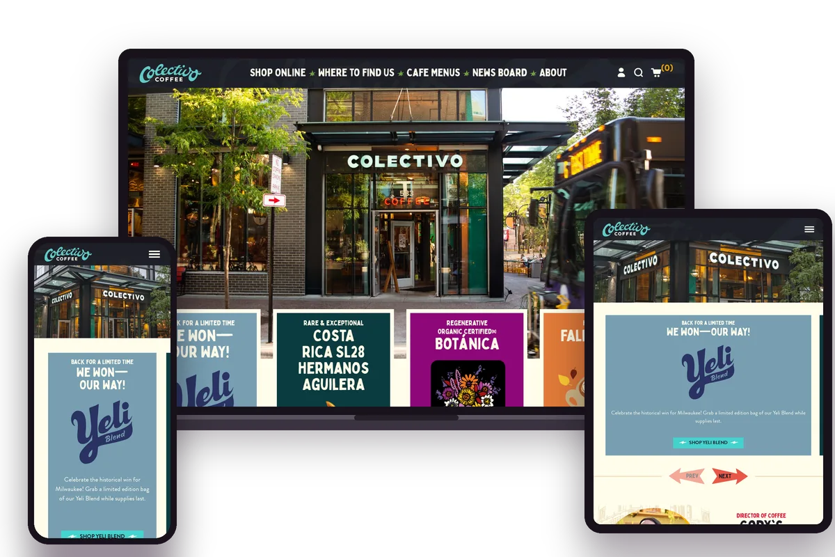
Colectivo makes it clear it's more than a coffee shop. Alongside Shop Online, Where to Find Us and Cafe Menus, the main navigation links to a News Board with the latest from the company. The homepage promotes the app for skipping the queue and earning rewards, while coffee, subscriptions, gift cards and merch sit in a well-organised shop.
A distinct, craft-focused brand
An app for ordering ahead and rewards
A well-organised online shop
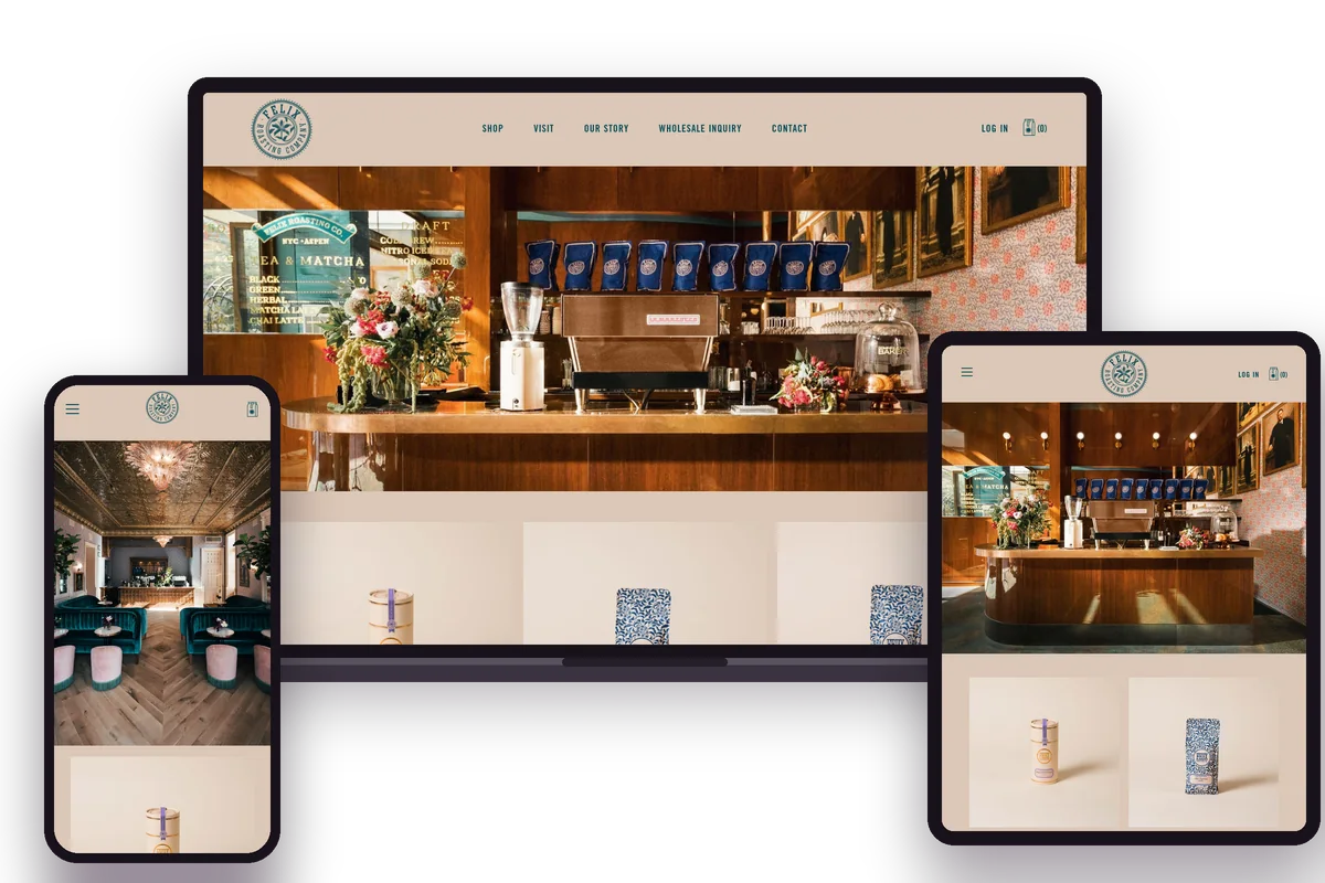
Felix Roasting Co. positions itself as a luxury coffee brand, and the website follows suit with large, cinematic imagery and refined type. The navigation is short: Shop, Visit, Our Story, Wholesale Inquiry and Contact. That restraint suits a brand with a handful of cafés in New York and Aspen, where the experience of visiting matters more than packing the homepage with information.
Luxurious, cinematic visuals
A short, five-item navigation
Refined typography
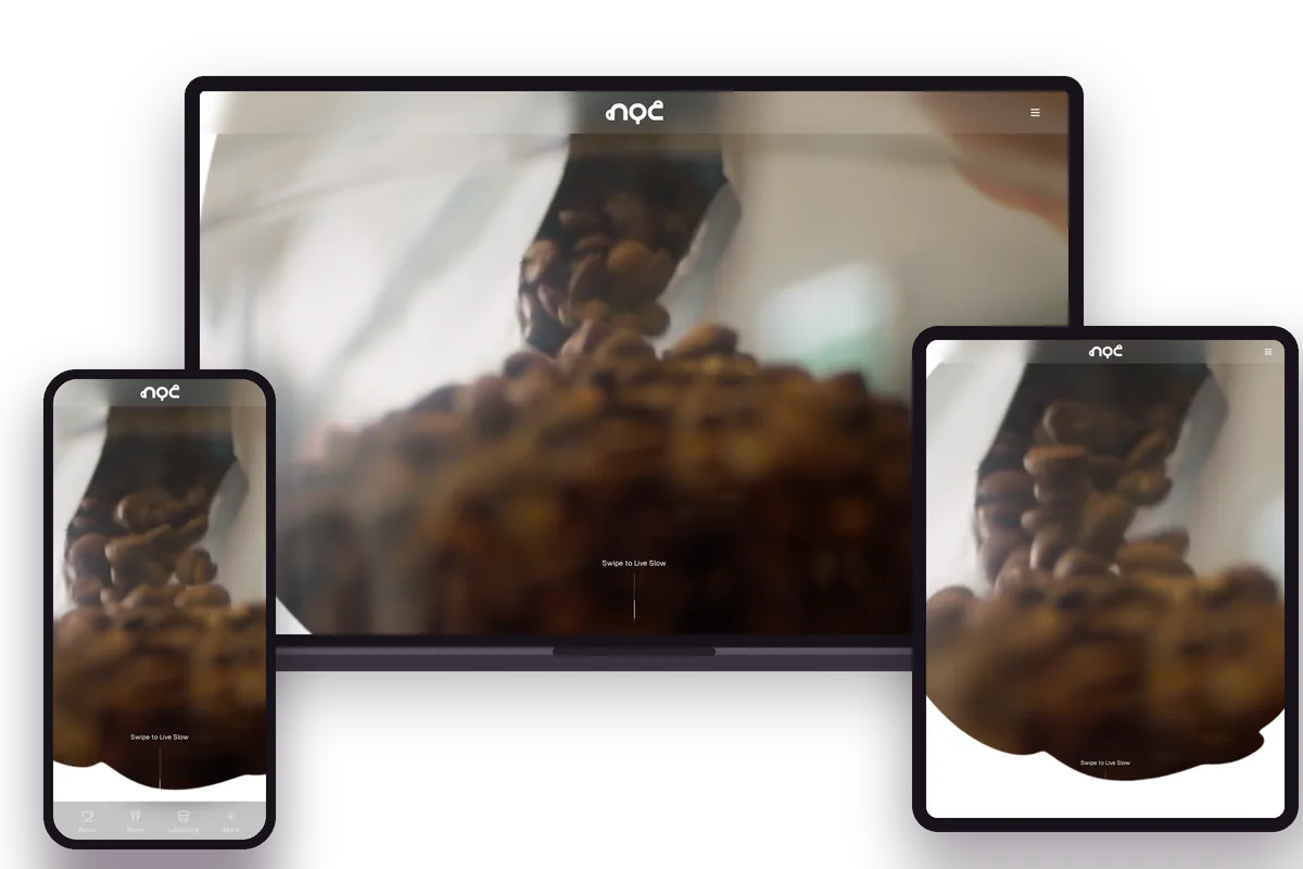
NOC describes itself as a speciality coffeehouse from Hong Kong, with the tagline "Live Slow", and the website takes that idea literally. A minimal, monochrome design with generous white space keeps the homepage calm and uncluttered. It's the opposite approach to the busier sites in this round-up, and a useful reminder that a café website doesn't need to say everything at once.
Minimal, monochrome design
A clear, one-line brand statement
Generous white space
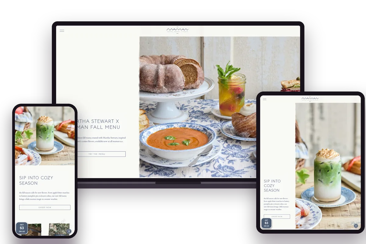
Pastel colours, delicate type and illustration give Maman a warm, French-inspired feel that matches its cafés. The practical side is strong too. Order Delivery & Pickup comes first in the navigation, followed by Locations, a shop for cookies and gifts, Events and Catering. The footer adds iOS and Android app links and a loyalty scheme for regulars who'd rather order from their phone.
A warm, French-inspired look
Online ordering for takeaway and delivery
Custom illustrations
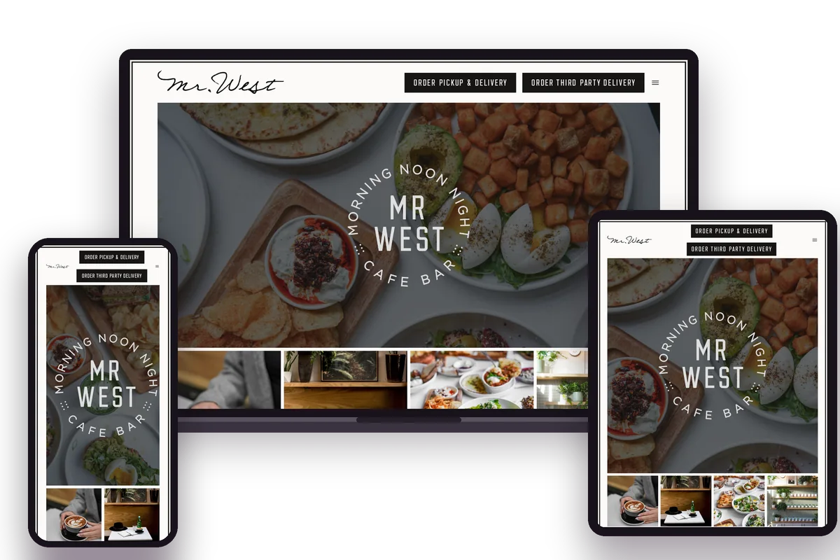
Mr. West reads more like a lifestyle magazine than a café website, with editorial-style photography and a tagline that sums up the offer: easy drinking, tasty fare. Despite the polish, ordering comes first, with separate links for pickup and delivery and for third-party delivery right at the top. Locations, a newsletter sign-up and contact details sit in a tidy footer.
Lifestyle-led branding
Ordering links at the top of every page
Editorial-style photography
From the round-up
After we rebuilt the site on WordPress and Elementor, Google PageSpeed rose from 32 to 67 on mobile and from 62 to 99 on desktop.
“… The website was built to a high professional standard yet also has tons of personality and individuality. It has provided great value for money also, would highly recommend!”
Tom Drew, Little Bagel Co.
Your café next
Book a free 30-minute call about your café's website: your menu, ordering, bookings and what it needs to do.
FAQs
What should a café website include?
At minimum: your menu, opening hours, address and a way to order or book, all easy to reach on a phone. After that, photography, illustration and a short story about your café help people decide to visit.
Do I need online ordering on my café website?
Not necessarily. Many cafés link to services they already use. For example, Little Bagel Co. links to Square for click and collect and to Uber Eats for delivery. Your website is yours, so you can add a book-direct option or link to the services you already use. We can help you decide.
How much does a café website cost?
It depends on the number of pages, features such as ordering or bookings, and how much custom design you want. Our website cost calculator gives you an estimate, and our pricing and packages page shows what's included.
What platform should I use for a café website?
We build café websites on WordPress and Elementor because they let you update menus, hours and photos yourself without a developer. Other platforms can work too. What matters most is that you can keep the essentials up to date easily.
How can I make my café website faster?
Start with a Google PageSpeed Insights test on mobile, then look at image sizes, plugins and hosting. When we rebuilt Little Bagel Co.'s site, its mobile PageSpeed score rose from 32 to 67. That's one project's result, not a guarantee, but it shows how much a rebuild can change. Read more about our speed optimisation work.
